Problem
Course choice lacked a clear decision path
Students needed to quickly understand the difference between faculties, courses, schedules and pricing.
Education Platform / Web Design / UI UX
A responsive education platform for university entrance preparation, structured to help students compare courses and choose the right next step with confidence.
03
Core product flows
02
Responsive platforms
01
Scalable design system
01
Content-ready structure
Case logic
Problem
Students needed to quickly understand the difference between faculties, courses, schedules and pricing.
Solution
Content is ordered from faculty and course discovery through curriculum and key details to enrolment.
Process
We simplified the information structure first, then translated it into responsive screens and reusable components.
Result
New courses, faculties and content modules can be added within the same structured system.
Overview
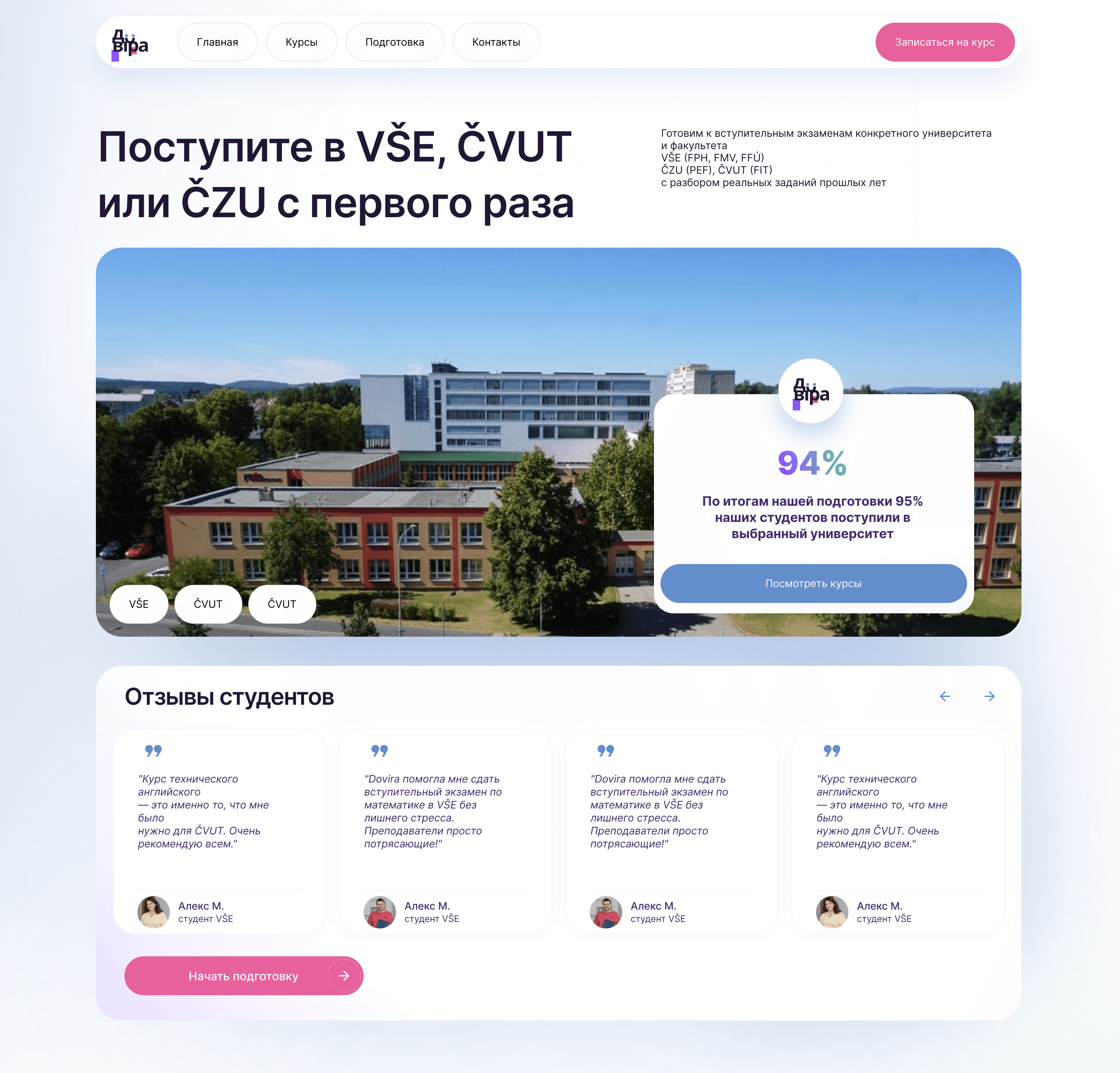
A responsive education platform with a content-led homepage, course catalogue, course detail pages and mobile flows.
Students needed to compare faculties, course scope, schedule, teachers and price before choosing a preparation course.
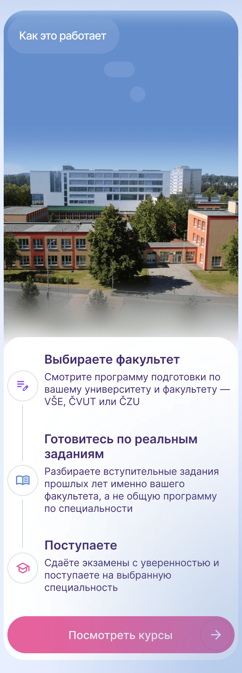
The structure guides visitors from faculty and course discovery to curriculum, schedule, lecturer, price and enrolment.
Responsive page layouts, course cards and filters, detail-page modules, mobile screens and reusable UI components.
Design Process
Mapped the information students need before choosing a course.
Grouped faculties, courses, schedules, curriculum and enrolment actions into a clear hierarchy.
Reduced the path from discovery to a relevant course detail page.
Translated the core experience into desktop and mobile layouts.
Defined reusable typography, spacing, cards, filters and controls for future content.
Visual Identity
Elegant sans-serif hierarchy with calm reading rhythm.
Warm whites, soft slate tones and quiet blue accents.
Cards, buttons and content modules designed as reusable blocks.
Generous whitespace and consistent layout proportions.
Homepage
The homepage establishes the decision path: target universities and faculties first, then proof, course discovery and a clear preparation CTA.
Key Features
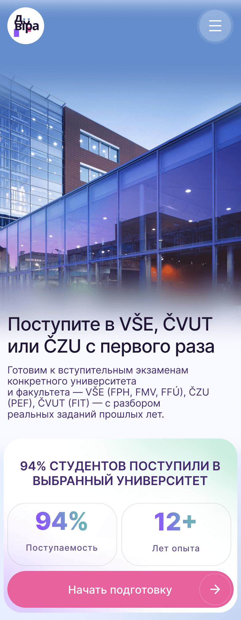
Responsive Design


UI Showcase
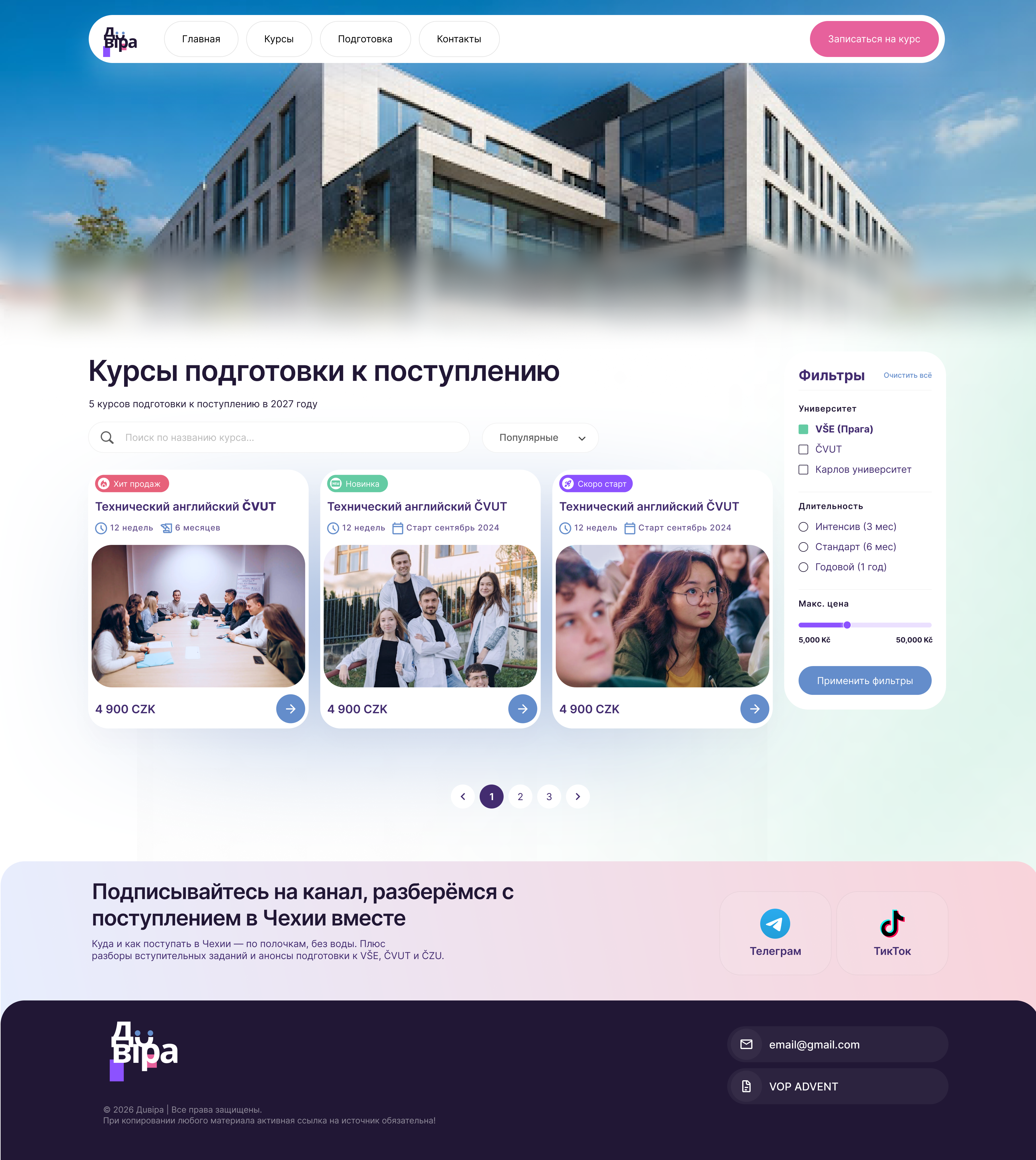
A calm browse experience that helps students compare learning options.
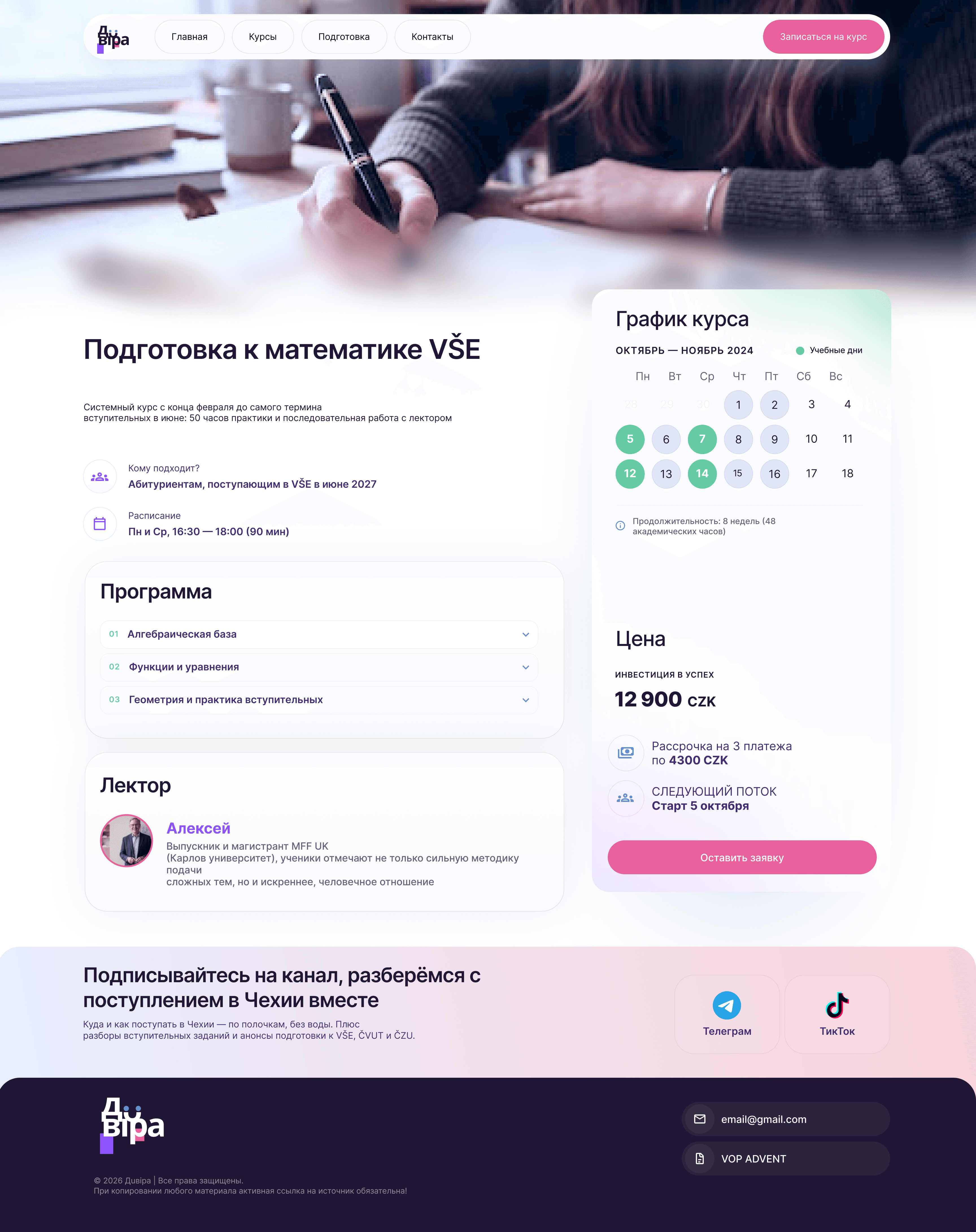
A focused view for lesson value, context and confident next steps.
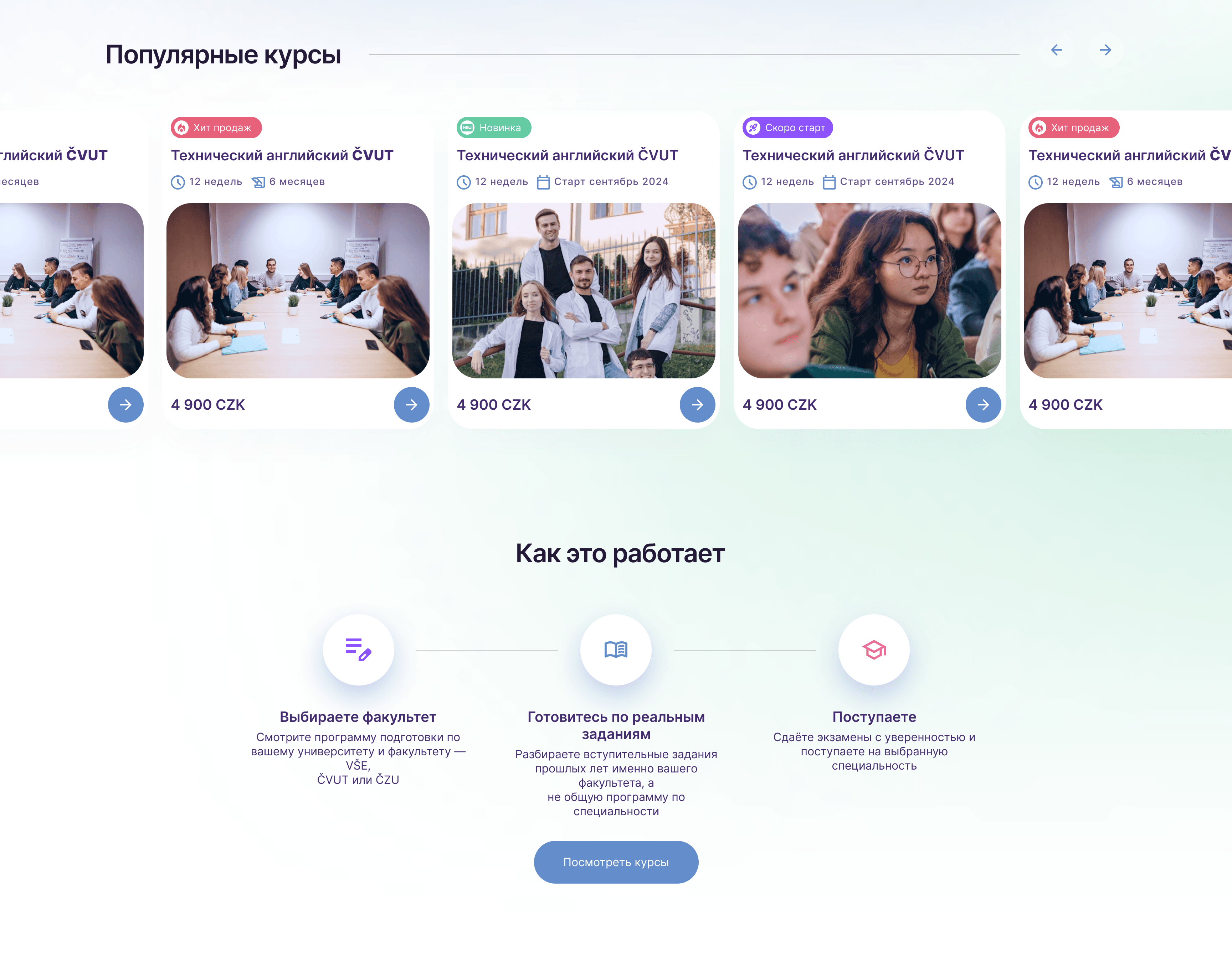
A simple section for discovery, highlights and quick scanning.
Design Highlights
Focused flows, fewer distractions and readable content blocks.
Comfortable contrast, clear hierarchy and predictable controls.
Lean layouts prepared for fast loading and smooth browsing.
Reusable sections for courses, teachers, modules and updates.
A coherent design system across desktop, tablet and mobile.
Final Result
Dovira Education now has a clear route from discovery to enrolment, a structured course-detail model and reusable responsive components that can support new courses, faculties and content without rebuilding the experience.
Dovira Education
Case study presentation by Loopvia